What Data Studio is, and what it can do for you.
Slide 2: Welcome to Data Studio!
Tell your story in data:
|
Introduction to Data Studio
Learn the basics of using Data Studio. |
SLIDE 3: Visualize your data
Data Studio turns your data into informative, easy to read, easy to share, and fully customizable dashboards and reports. Use the drag and drop report editor to:
- Tell your data story with charts, including line, bar, and pie charts, geo maps, area and bubble graphs, paginated data tables, pivot tables, and more.
- Make your reports interactive with viewer filters and date range controls. The data control turns any report into a flexible template report that anyone can use to see their own data.
- Include links and clickable images to create product catalogs, video libraries, and other hyperlinked content.
- Annotate and brand your reports with text and images.
- Apply styles and color themes that make your data stories works of data visualization art.
Learn more about creating reports. To create a report, decide what data you would like visual. Setup a data source with underlying data you would like to use. Connectors match data set. A report is basically a blank canvas where you can visualization of your data. Multiple pages help organize in logical ways, time series, bar charts, the map shows geographic services. you can switch custom text, image, content from other websites, interactive control to filter data and let date range for a specific month or season. Easy to share and show the most relevant data.
SLIDE 4: Connect to your data
With Data Studio, you can easily report on data from a wide variety of sources, without programming. You’ll start with a data set — a system outside of Data Studio that contains the information on which you want to report. Your data set will contain two types of data:
-
Dimensions are data categories. Values may include names, descriptions, date information, or other characteristics of a category.
-
Metrics measure the things contained in dimensions. Metrics in your Data Studio reports are aggregated, for example, as sums, counts, or ratios.
Data sets are typically organized into rows and columns, where each row in the table contains one record, or instance, of the data.
In just a few moments, you can connect to data sets such as:
- Google Marketing Platform products, including Google Ads, Analytics, Display & Video 360, Search Ads 360
- Google consumer products, such as Sheets, YouTube, and Search Console
- Databases, including BigQuery, MySQL, and PostgreSQL
- Flat files via CSV file upload and Google Cloud Storage
- Social media platforms such as Facebook, Reddit, and Twitter
Learn more about connecting to your data.
- Connectors connect Data Studio to your underlying data. Connecting to your data creates a data source in Data Studio.
- Data sources represent a particular instance of a connector: for example, a connection to a specific Analytics view, MySQL table, or Google Sheet. Data sources let you configure the fields and options provided by the connector used to create that connection instance. In addition, the data source gives you a secure way to share information and insights with report viewers who may not be able to directly access the underlying data.
How connectors work
Each of the available connectors is tailored to a particular product or platform, and provides a specific set of fields and configuration options back to Data Studio. Some connectors provide all the fields from the underlying data (for example, Google Sheets and BigQuery connectors). Other connectors provide a subset of the fields from the original data (for example, Analytics and Ads).
How to use connectors
Conceptually, connecting to and visualizing your data involves seven steps.
(Detailed instructions are here.)
- Decide on the type of data to which you want to connect.
- In Data Studio, select a connector that matches that type of data.
- Authorize the connection to the platform or product you selected.
- Select the specific data you want to connect to, and configure any additional options or parameters.
- Confirm your selections to create a data source based on this connection.
- Add the data source to a report.
- Add charts and controls so you can use that information in your reports.
Types of connectors
There are, broadly speaking, three types of connectors:
- Google connectors are built by Google and let you access data from Analytics, Ads, Sheets, BigQuery, and other Google products. Learn more about Google connectors.
- Partner connectors are built and supported by Data Studio developer partners. Partner connectors let you access data stored in other Google and non-Google platforms, such as Facebook, Reddit, or GitHub. For more information, refer to the documentation provided by each partner connector. To see the list of available partner connectors, visit the connector galleryand scroll down to the partner connector section.
- Community connectors are connectors anyone can build. These let you access any internet connected data, such as your own private corporate databases. Learn more about the Community Connectors developer program.

The connector gallery.
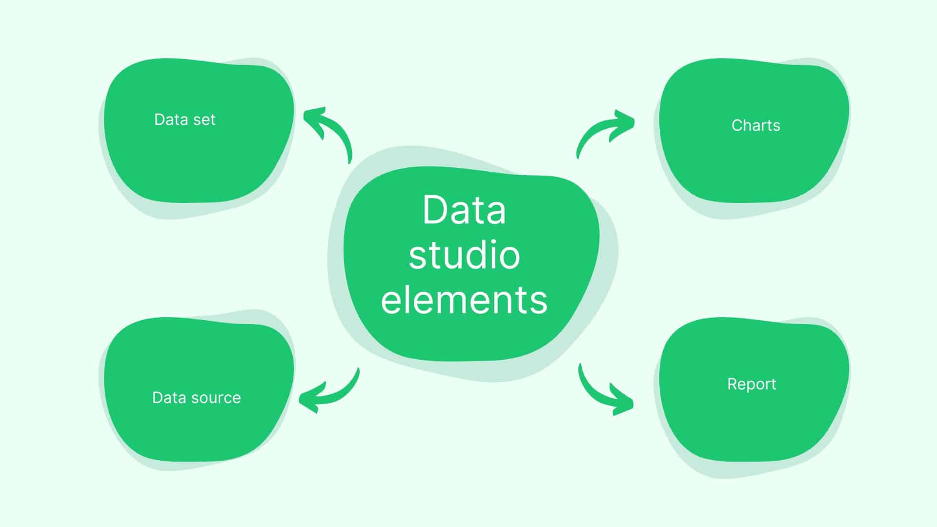
SLIDE 7: How data sources work
A data source is a Data Studio file that lets you manage and configure a specific connection to your data. Data sources are responsible for:
- Controlling who can view the data provided by the connector.
- Letting you customize the fields available for use in reports.
- Letting you share a common view of your data with other report editors.
- Providing other data management configuration options.
SLIDE 8: Types of data sources
There are several kinds of data sources:
- Live connection data sources update the data in your reports automatically. The data remains in the underlying data set; it is not stored by Data Studio. Most connectors create data sources of this type.
- Extracted data sources provide a static snapshot of your data, which gives better performance when querying the data. You can update the snapshot whenever you want.
- Blended data sources combine the fields from up to 5 data sources. Blended data sources only exist in the reports in which you create them. They can’t be shared independently from the report.
SLIDE 9: Reports and data sources
Once you’ve created a data source, you can add it to reports. This lets you use all of the fields in that data source as the basis for your visualizations. Reports can include multiple data sources, allowing you to visualize data from different platforms in the same report.
The diagram below illustrates a report that gets its data from three different platforms, Google Analytics, Google Ads, and a third-party platform (such as Salesforce or Facebook) provided by a partner connector:
| Report | |||
| Data Sources | |||
| Connectors | |||
| Product or platform | |||
Share data sources
Sharing a data source lets other editors add it to reports, even if those editors don’t have direct access to the underlying data itself. Note that sharing a data source does not grant access to the underlying data. When you share a data source, you have the option of giving other people view-only access or edit access.
- You can share reports without sharing its data sources.
- Caution: If you share a data source with edit access, other editors may be able to modify the data source in ways that break your reports.
SLIDE 10: Share and collaborate
It’s easy to share your insights with individuals, teams, or the world. Invite others to view or edit your reports, or send them links in scheduled emails. To tell your data stories as broadly as possible, you can embed your reports in other pages, such as Google Sites, blog posts, marketing articles, and annual reports.
When you share a Data Studio file with another editor, you can work it together in real time as a team.
Learn more about sharing.
There are a few access settings to keep in mind as you use Data Studio:
- “Permissions” determine who can view or edit your Data Studio files — that is, your data sources and reports.
- “Credentials” refers to who can see the data within those reports. owners credentials and viewers credentials.
With Data Studio, you can connect a variety of types of data, which will flow into Data Studio and to your reports known as a data visualization program for free. Because of the variety of charts and graphs, you can better see the story behind your numbers. Data Studio lives in the cloud. You can see your reports on any device that is web-connected. You can use an existing template or create one from scratch. You can also add design components of shapes, images, and text. Can load data from a number of systems such as Google Sheets, MYSQL, Google Analytics, CSV files, google ads, and more. Developers can also create custom data connections with their own platforms. Reports dynamically update once data is connected correctly from systems to your report so you don’t have manually re-upload or re-enter it. Easy, free, customizable data visualization.
To create, edit, and share reports and data sources, you’ll need to be signed into a Google account that can use Google Drive. There can only be one owner and you can give editor and view access permissions. Data sources also have permissions.
o review, Data Studio has two types of files: data sources and reports. The data source is where you can view and edit the data schema, and reports are where you build your visualizations.
For each file, you can give others view or edit access, at which point they’ll receive an email with a link to view or edit that file.
The ability to see the actual data — as opposed to simply viewing or editing the report’s structure and design — is governed by data source credentials.
When you first create a data source, you authorize Data Studio to access that data by providing your own credentials to the data set. This is a one-time action; you don’t need to provide your credentials again, unless you revoke access.
To determine whether others can view report data, the data source credentials setting has two options: Owner’s and Viewer’s:
- Owner’s Credentials uses the credentials of the data source owner to allow others to view data in reports.
- Viewer’s Credentials requires that viewers have their own access to the data in order to be able to see data in reports.
Editing Reports
Simply drag and drop charts and then edit using data filter options and formatting options.
Complete all reports from the Google Analytics account. LinkedIn platform data must be accessed through the Company Linkedin Account.
Steps:
- Clear browsing history/get rid of caching in the browser
- Refresh data in “raw” file using Google analytics account
- Download reports from Marketo labeled for MTD and Weekly Data for Google and Linkedin
- Upload the 4 reports into a Google Sheet by clicking on the correct tab and then selecting file -> upload -> dragging CSV file -> replace current sheet
- Check Data Studio report by refreshing data first against data on Google Ads platform
- Go to Google Ads logging in as analytics account and select the correct account
- Go to correct ad account and select campaigns
- Select the date in Google Ads for the weekly report time period of that specific week (aka last 7 days) and look at total account numbers
- To confirm all data matches up in Google native platform with Marketo reporting; any discrepancies should be called out from native platform to Marketo reports
- Check Data Studio report by refreshing data first against data on each native platform
- Go to LinkedIn ads logging into company LinkedIn account and select correct ad group account
- Click on Work and Advertise on the top right-hand corner of LinkedIn
- Click create an ad and select Company Page LinkedIn Ads
- Go to correct Google Ad account and select campaigns
- Manually select last 7 days from the previous Monday to Sunday
- Select the date in Campaign Performance for the weekly report time period of that specific week (aka last 7 days) and look at total account numbers (Conversions: Select Conversions and leads in columns tab)
- To confirm all data matches up in the LinkedIn native platform with Marketo reporting; any discrepancies should be called out from the native platform to Marketo reports
- Update Manual Graphs
- Download verified report as PDF, save as “name of the report with a date”
- Draft insights, including conversion numbers by country
- Send to clients with individual emails of reports attached.
Here is the blog article from Supermetrics on Facebook Ads and the article from Google Analytics on how to use Facebook Data into Google Data Studio as well.
Quiz:


-
Data Studio is a free data visualization tool you can use to create simple or complex reports from your data.
-
You can connect data from a variety of sources to a Data Source, which can be used to create reports in Data Studio.
-
Data Studio can update your reports dynamically based on changes made to the connected data set.
-
If you have a spreadsheet with data, CSV file upload is an option you can use.
-
You can invite others to view or edit your Data Studio reports and data sources, to facilitate collaboration and share your insights.
-
You can limit or open viewership of the data by changing the data source credentials setting.


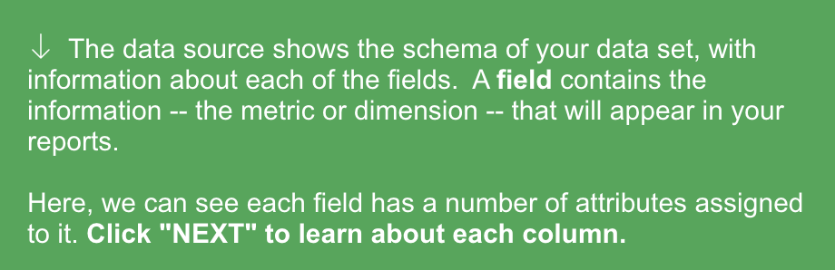
The index is the numerical value assigned to a specific metric or dimension. This is the position of the Field in the data source. The Field menu includes the following options for creating new data source fields:
- The count is an aggregation that counts the number of values of a field within the current filter context. Each occurrence of value is counted.
For example, if “Country” = US, DE, FR, US, US, IT, then Count = 6 -
Count distinct counts only unique values, excluding duplicates.
Using the same example, if “Country” = US, DE, FR, US, US, IT, then Count distinct = 4, because the duplicate “US” values are excluded.
Clicking either of these actions will create a new field that serves to count (all or distinct) values of the selected field.
-
Duplicate creates a new field identical to this one, which you would edit to be represented a different way.
-
To Disable a field means it won’t be available for use in charts referencing this data source.
-
To Remove a field means it’d be permanently deleted. This option is only available for fields that you (or a collaborator) created in Data Studio via duplication or calculation; this option will be grayed out if the field came directly from the data set.
Click outside of the menu to close and continue without making changes.
Aggregation refers to how the data is structured, i.e., if it groups values together at all.
In Data Studio, fields can have the following aggregation methods:
- Average
- Count
- Count Distinct
- Max
- Min
- Sum
- Auto
- None
The description provides you with details about what is captured in the specific field.
The top right contains a Search field, which you can use narrow down the list of fields viewed by name to easily find the metric or dimension you’re looking for.
“Add a field” allows you to create a new metric or dimension derived from your existing data.
For example, you could create a new metric that represents the average of a metric, the sum of the values of a dimension, or the ratio of two different metrics.
This first set represents the data credentials — that is, who has access to view this data in reports. Here, we can see that this data source is currently using the owner’s credentials, so anyone who is invited to view or edit a report representing this data source can see this data in charts. This is because we — as the owner — have elected to allow viewers to use our own credentials for the purpose.
(Tip: If you are the data source owner, you’ll be able to edit this setting here. If you are not the owner, you’ll be able to see — but not edit — this setting.)
Charts are visual representations of the data. Examples of charts include bar, line, pie and table charts. Shapes can add structure to your report.
For example, the light red backdrop behind these Counts is simply a rectangle, but it efficiently sets apart and highlights these counts.
Images customize your report. For example, the “Google Merchandise Store” logo at the top of this report is an image that brands the report.
Text is another component of a report that helps the report creator tell their data story. You can use text to annotate charts or other components. The bottom of the page will display the date the data in this report was last refreshed.
To refresh the data, you can click the refresh button in the upper right corner of the report. This concludes your report overview!
The first section is the Layout tab of the right panel, which controls settings that are visible when in View mode.
-
Header visibility controls the behavior of the report header in view mode. The header contains things like the report title, the share button, and edit button.
-
Navigation position refers to where on the report the page selector appears. Page names can appear as a panel on the left side, or as a drop-down from the top navigation.
-
Display mode governs how your report fits in a viewer’s browser window, specifically whether it will fill the user’s browser or always display in its actual size.
Once scrolling down the Layout tab, we see settings for canvas size, grids, and report-level components.
-
Canvas Size lets you select from a number of preset sizes or enter custom display dimensions for the size of your report pages.
-
Grid Settings control how the editor’s gridlines appear. The minimum canvas grid size is 10 px. Increasing the grid size makes it easier to layout your charts, controls, and other components.
-
Report-level component position determines how report-level components interact with other components on the page.
Theme settings apply aesthetic properties across the report’s components, such as colors, font sizes, font types, borders, and shadows.
Theme selections apply across the report’s charts, text, and so on.
Now the chart is selected, and the editing panel on the right now reflects details about this chart. The top header of the panel contains different chart types; clicking on “Chart Time Series” would enable you to seamlessly change the time series to a different type of chart.
Below that, there are two tabs:
- The Data tab controls the data supporting the chart.
- The Style tab controls the look and feel.
The Data tab allows the configuration of the following:
- Data Source: Choose one data source per chart, or blend data from multiple sources as needed.
- Fields: The dimensions and metrics you’ll visualize in this specific chart. You can see and search all available fields on the right side of the panel.
- Date Range: Select a default start and end dates for a chart’s data.
- Filters: Narrow the set of data that will be included in this chart.
In the Style tab, you can select the fonts and colors associated with a specific chart, count, or table.
Unlike the report-level Theme tab, these aesthetic selections only apply to the currently selected chart(s), and often include chart-specific details.
For example, you can see that this Style tab includes options related to line thickness and color, trend line inclusion, axes, and more options specific to a time series chart.


